OK, here's the deal: I don't currently have any landing pages live on the Internet. I know, I know, hard to believe! But true, nonetheless. There are many reasons for it. I brought my personal pages down because I'm focused on getting a job, not on getting more clients. The clients who had pages for offers I was maintaining, along with PPC ads, have stopped those initiatives. Therefore, it's a perfect time for me to look for work opportunities with Fortune 500's or Agencies!
But Mike, you may be wondering, how will we know you have what it takes to build world-class landing pages? Well, that's super simple to solve! I'll simply mock-up landing pages for world-class companies here on this website using the UI styles I built for this website.
So here goes ... copies of some of the most successful, yet non-functional comp branded landing pages on the Internet.
... Oh, and since most landing pages don't have navigation, these are going to open in a new page. Just close them to come back to this website.

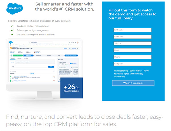
Salesforce has a great landing page. You can see the real version here. There is a lot going on in this. As you move from mobile to desktop versions, images and text in the header appear and the image of the person in the testimonial moves from above the text to the right side of the text - which is opposite the normal flow.
Salesforce used a mixture of Bootstrap and their own blend of grids with class names like "col-md-6-ten." Why would they do this? Well, Bootstrap is a 12-column grid. Which is great, but it's hard to get a row with a 60% width column and a 40% column.
But I thought, it was a waste to reinvent the wheel. Who cares if the top section is 58.333% instead of 60%? I don't. And I duplicated the page with less code. That said, they did a great job and should be proud of their work!
CHECK IT OUT IN A NEW WINDOW!
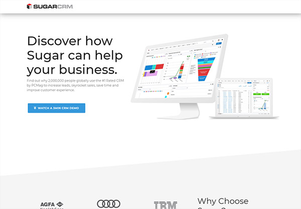
Sugar's landing page is basic and matches the CRM very well. You can see the real version here.
I know how web development works, so I know that good is good enough - especially under a deadline. But there are special tricks used on this page and they not only didn't make the page more attractive; they also take up a lot of space. I mean, people don't scroll. We know this. So why put a form at the bottom and add extra space just to make angled sections?
Plus, I bet you could create the angles with images instead of CSS. Sure, it would probably add 60K to the page, but ... wait, why couldn't it just be straight lines?
And how about that green huh?!? I thought I should change the color of the blue "Watch the Demo" button, but why? Blue and green are complimentary colors. Besides ... did you see the green?
CHECK IT OUT IN A NEW WINDOW!
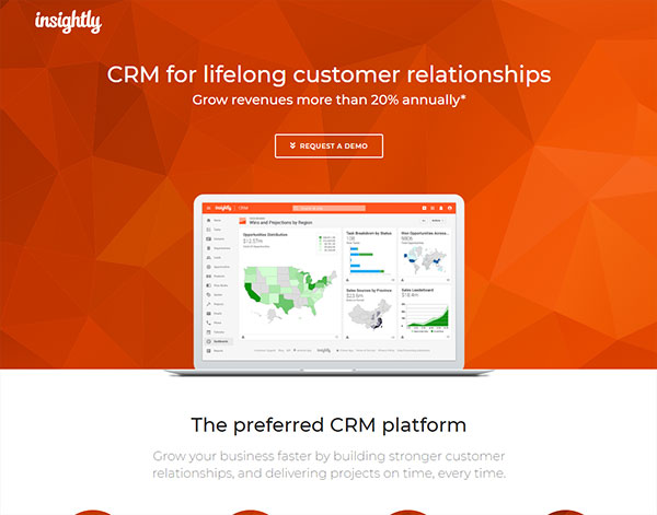
Insightly has a super cool landing page that matches their style. You can see the real version here.
The only thing is, they really went all out! There's a ton of back-end things going on: Tag manager, CDN downloading, Drift bot, a Glide slider, and almost every image is an SVG - wow!
I love seeing sites like this because I have evidence that even though I load things into websites to make them functional - everyone else does too. I mean why are we going to 5G if we can't download an image or seven?
Anyway, I loved putting this together. I left out the slider as I didn't think it was that important for this and since I'm using Bootstrap 4, I didn't go with 5 client logos, just 4. Because it's not easy to divide 12 by 5. I guess that's why everyone wants to create their own grids so they can get 5 logos across or use 10 columns as the default instead of 12, but I think it's almost pointless. I mean, look at the page and tell me if you need one more logo!
CHECK IT OUT IN A NEW WINDOW!